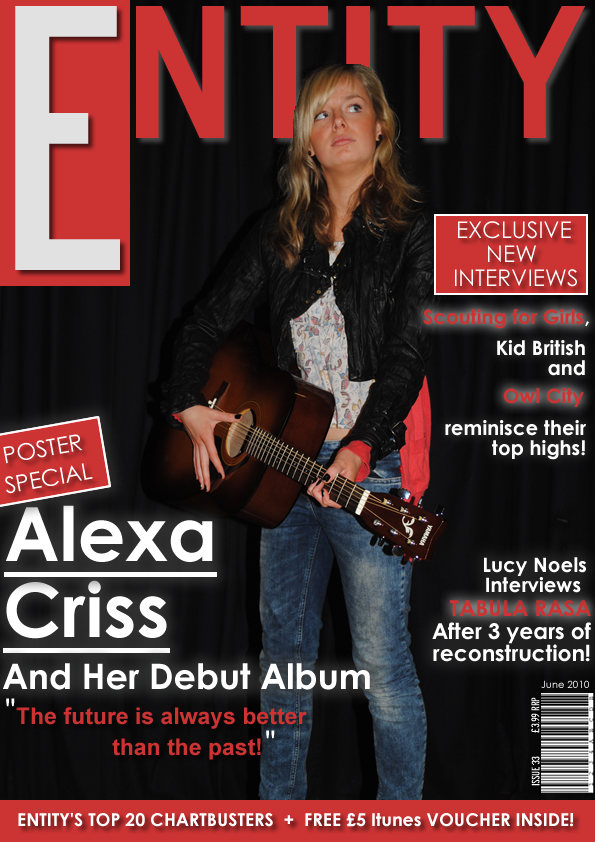
In order to portray my artist on the front cover in a way where she would represent the genre ‘Indie Rock’, I made sure that the props I used would symbolise that. The guitar represents her as being into the Indie genre of music along with her jeans and jacket. I kept the background of the black curtains to keep the continuity of music as it represents the artist on stage. The pose connotes that she is over confident and looking to be successful as she is looking away from the camera into the sky. This pose also anchors the text along side her, showing that she is optimistic. The long shot of the artist is positioned in the middle of the page for full view of her body. I placed her on top of the masthead which connotes that the magazine is also confident and popular. In conclusion consumers would be engaged to look at the product.
To represent the target audience, we conjured up a font that would stand out and appeal to the ages of 16 – 25. I also made sure that the other artists I included would appeal to the target audience as well as maintaining the music genre. We then looked at other magazines with the same target audience to help think of ideas to attract the audience. In conclusion of this I decided that at the bottom of the page, I would include short information that would appeal to them. For example, I said that there was a free promotional within the magazine, “Free £5 ITunes Voucher Inside!”
As a team, we decided that for our house style, we would use red with a drop shadow. The red connotes importance and alongside the drop shadow, the idea of being an important, confident magazine was created.
To aim towards our audience with social grouping, we made sure that we kept to the conventions of a music magazine and therefore the price of the magazine was made at an acceptable price for those who lie within the social grouping of C1, C2, categories for a well known music magazine.
To represent my magazine as being popular and a top buyer, I made sure that it would include the latest news and interviews. The promotional copy of ‘Exclusive new interviews’ make our magazine seem more popular than the other leading brands. Also, the ‘Poster Special’ encourages the readers to buy the magazine as they receive a promotional product which they will see as being good value.
I have used Blumier and Kats’ theory of ‘Uses and Gratifications’ throughout my front cover. The Exclusive new Interviews, gives a sense of information and educate as the audience are able to learn about celebrity artists and their childhood, which they wouldn't have heard before. They can also escape with the interview with Lucy Noels and Tabula Rasa as they can forget about their lives and worries, and read up upon others. There is also Entertainment that intertwines as the ‘Top 20 Chartbusters’ as they would be able to engulf themselves in new music.
Throughout the front cover we have followed the conventions of a professional music magazine. We included a bar code, with the price, issue number and the date around the outside. We kept the same house style between all 3 magazines. This included the same colour scheme, the same font, same layout of pictures and the same box graphics. I looked at a few music magazines to make sure that the price was reasonable. We also created the magazine as a monthly magazine and as a consequence each magazine was a consecutive different month.
Front cover analysiss
View more presentations from MFJ .
No comments:
Post a Comment