Tuesday, 20 April 2010

Michael's Evaluation Of Front Cover


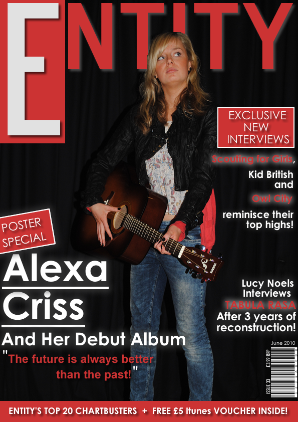
In order to portray my artist on the front cover in a way where she would represent the genre ‘Indie Rock’, I made sure that the props I used would symbolise that. The guitar represents her as being into the Indie genre of music along with her jeans and jacket. I kept the background of the black curtains to keep the continuity of music as it represents the artist on stage. The pose connotes that she is over confident and looking to be successful as she is looking away from the camera into the sky. This pose also anchors the text along side her, showing that she is optimistic. The long shot of the artist is positioned in the middle of the page for full view of her body. I placed her on top of the masthead which connotes that the magazine is also confident and popular. In conclusion consumers would be engaged to look at the product.

To represent the target audience, we conjured up a font that would stand out and appeal to the ages of 16 – 25. I also made sure that the other artists I included would appeal to the target audience as well as maintaining the music genre. We then looked at other magazines with the same target audience to help think of ideas to attract the audience. In conclusion of this I decided that at the bottom of the page, I would include short information that would appeal to them. For example, I said that there was a free promotional within the magazine, “Free £5 ITunes Voucher Inside!”
As a team, we decided that for our house style, we would use red with a drop shadow. The red connotes importance and alongside the drop shadow, the idea of being an important, confident magazine was created.
To aim towards our audience with social grouping, we made sure that we kept to the conventions of a music magazine and therefore the price of the magazine was made at an acceptable price for those who lie within the social grouping of C1, C2, categories for a well known music magazine.

To represent my magazine as being popular and a top buyer, I made sure that it would include the latest news and interviews. The promotional copy of ‘Exclusive new interviews’ make our magazine seem more popular than the other leading brands. Also, the ‘Poster Special’ encourages the readers to buy the magazine as they receive a promotional product which they will see as being good value.

I have used Blumier and Kats’ theory of ‘Uses and Gratifications’ throughout my front cover. The Exclusive new Interviews, gives a sense of information and educate as the audience are able to learn about celebrity artists and their childhood, which they wouldn't have heard before. They can also escape with the interview with Lucy Noels and Tabula Rasa as they can forget about their lives and worries, and read up upon others. There is also Entertainment that intertwines as the ‘Top 20 Chartbusters’ as they would be able to engulf themselves in new music.

Throughout the front cover we have followed the conventions of a professional music magazine. We included a bar code, with the price, issue number and the date around the outside. We kept the same house style between all 3 magazines. This included the same colour scheme, the same font, same layout of pictures and the same box graphics. I looked at a few music magazines to make sure that the price was reasonable. We also created the magazine as a monthly magazine and as a consequence each magazine was a consecutive different month.


Michael's Evaluation Of Contents


I have followed several conventions within my contents page. For example, the editorial column is positioned towards the bottom right of the page alongside a photo of the ‘Executive Editor’ and his signature. To create the signature, we downloaded a font which looked just like somebody had hand written it. Whilst writing the editorial column I made sure that the context would appeal to the target audience via the use of media grouping. As our target audience would be the ones who regularly check up on the internet, newspapers and TV, so the language I used and names presented was clear and appealing. We also realised that the audience we are targeting would have the latest technology, for example Ipods, Mp3’s and the latest mobile phones. So we decided to create a heading within the regular’s column called ‘Enlist the playlist’. Here the readers can look up at what Entity believe should be on their playlists!
To keep the continuity of house style, we used the same uppercase font for the title of the contents page that was the same as the masthead of the front cover. Including the colour scheme and just under the title of the page is a clearer issue number. These little things made the contents look more professional and easily noticeable.
To get ideas of conventions for a music magazine, I created a radial analysis on kerrang and Q. This way I was influenced by their styles and then altered them to create a layout which would appeal to the target audience and make the contents page itself to be easily navigable.

To represent the month’s issue of the magazine, I made sure the language and style I used would continue from the front page. For example, under the ‘Features’ heading, I kept the copy ‘Exclusive New Interviews’. This combined with a graphic ‘cover story’ makes page is easily navigable for those who want to look at a specific story from the front cover. Also, when I wrote about certain articles that may seem exciting for the consumer to read, I included exclamation marks; “Best 20 top sellers this month!” This way the reader is intrigued to read more as it may give them the solution of excitement to replace their inadequacy – boredom.
To represent the magazine as being informational as well as exciting, I made sure that I would add an article based on a comedian that will appeal to the target audience. “A round with… Justin Lee Collins”. This way, if the reader no longer wants to read about music, then he/ she can read some humour to escape (uses and gratifications) from the world.
I styled the artist at the top of the page in a way where he would be an aspiration for the segmentation of the target audience. The skinny jeans and long sleeve jumper create a perfect image to the readers. He is positioned mainly to the right and looking down which signifies that he isn’t confident and shy. Thus appealing to those in a similar situation.


Michael's Evaluation Double Page Spread


I dressed the artists in specific clothes that represent the genre of music they create. I used a checked shirt to create a feel of the Indie Rock genre that my magazine is portraying. The second artist, located at the left of the page is partly cut off. This along with him wearing a coat over a jumper connotes that he still isn’t confident after the duo’s past.
For the background, I used an open field with houses located at the far back for the perfect scenery that I had planned. I wanted to represent the band of having a rough past which is why I made sure there were houses at the back, and I wanted to connote that the band have a lot of free space to roam free; the use of the field.
When choosing the size of the photograph, I made sure that it would dominate the image and along side the effect the camera had when the photo was taken, I achieved that as the background has a blurred effect. The space this created was perfect for putting in some text.

For this page to appeal to the target audience I made sure that the pull quote I used; “we’re determined to rise to the top again” would be an inspiration for the segmentation of the target audience. To help this stand out I put a drop shadow on it to show that it’s an important piece of copy on the page.
To make sure the text would appeal to the audience and be relevant to their lives. I made sure that it would have the gratification of being entertaining as well as having a solution of clarity for their confused inadequacy, as they can relate to the article and take advice on what they can do to help in their situation.

My double page spread follows a lot of conventions of a music magazine. The house styles of all 3 double pages have been kept the same. For example, I used the same colours, fonts and effects from both the contents and front page. The use of the “New to Entity” graphic helps inform and educate the audience as well as being an exciting article to look forward too. I used a heading above the article as I found it was a common thing to do and was well presented. To find a decent idea for the double page, I looked in Q magazine, Kerrang and Uncut. I used ideas from both magazines to conjure up a final template on which the rest of the group used. I also found that within the Uncut magazine, the text was based upon a graphic that was translucent. I liked this effect as it doesn’t ruin the image but also makes the copy easy to read.

Michael's Evaluation Of Journalism

For my journalism that I conjured up for my double page spread, I wanted to represent my artists seem confident and on a level where they could interact with the youth by using informal and colloquial language.

To start the journalism off, I wanted the duo to represent them as being “normal” people and that their fame hasn’t affected their ego. To accomplish this, I wrote about ‘Rex’ and how scared he was the first time he was on stage. Doing this helps the duo interact more with the readers so they can get an idea of their personality.
I also made sure I included the duo’s forenames to create a relaxed tension and a personal relationship with the audience which would create a positive vibe throughout the article.

I used a lot of musical lexis to show how popular the duo is and how incredible their talent is to achieve nominations for their music. I also wanted the duo to come across as friendly and confident, which is why I come up with the idea that they would be going on a lot of tours and concerts. Achieving this increases the respect they would receive from the audience.

I also wanted to create a story that would inspire the target audience. To do this I had to make sure that the music Tabula Rasa performed wouldn’t be the only talent they have. Instead I wanted to portray them as people to be inspired by the public by helping the youth stay of the streets to keep a safer society and spreading their talent by teaching them how to play other musical instruments.

Michael's Preliminary to Final Product

My skills of the use of technology have improved considerably since the preliminary task of creating a school magazine. I have now seen how much time and effort is needed to create the perfect music magazine. From the layout and house style to the journalist entry; in order for my magazine to be successful.

My use of technology has improved noticeably. I now know how to navigate Macromedia Fireworks MX 2004 at a steady pace. By using this software, I managed to conjure up ideas for a house style and layouts for each of the magazine front covers, contents page and the double page spreads by using certain tools like the lasoo tool where I was able to cut out the head of my model on the front cover out and paste it as another layer so her head would overlap the masthead. This made a dramatic change in the appearance and quality of the magazine from the preliminary school magazine to the finished music magazine. By using the scale tool; I was able to rotate, enlarge and skew both pictures and graphics in order to make my magazine to look professional. This made a dramatic difference to the software that I used for my preliminary. I used word which had several editing tools but I felt restricted. For example I could skew the font but couldn’t create a drop shadow.

As I have no experience in photography, this was probably the biggest challenge for me. When we had decided a structure of how we would stage the photos, I then took it upon myself to try and take photos for my magazine. I had my ideas set out in my head but when it came to me taking pictures, I was useless unable to fulfil my wishes. However, after a lot of practise and advice from fellow photography students, I was able to take a range of pictures from which I then chose the best one. To edit my photos, I used a program called Picasa. Here I was able to edit the lighting of my photos to either increase the light or decrease.

I have also increased my knowledge of internet websites ranging from www.blogspot.com to www.dafont.com. For my preliminary, my knowledge of some of these websites was restricted, and therefore for my fonts I used default fonts already installed on the computer. However, for my final product I was determined to find a font that fitted in with the genre of music my magazine was to portray. I then was able to install the font onto the computer in order to change the size, colour and then edit it with a drop shadow or outer glow.

By researching up on other magazine like Q, Kerrang and Uncut, I was able to read other journalist entries. I made sure that the copy I included in my magazine would reflect on the target audience and inspire them to do well in life. I created a background story on how the duo were forced to leave their record label and become independent and made to put all their hard work and effort in to become well known in the music industry again. The pull quote was made to stand out and draw in the readers’ attention.

Michael's Use Of Technology

Thursday, 1 April 2010

Production Phase

To complete our production work it took around 5 lessons which were 50 minutes/1 hour long.

In the first lesson we decided what genre of music we wanted our magazine to be and thought about the colours we would use and how we would style our models for our photographs.
After this was done we spent another lesson trying to find a name for our magazine. This was harder than we thought as we found it hard to agree on a name as we had different ideas on what we wanted it to symbolize. Because of this we decided to discuss our thoughts and each looked for names we thought were appropriate, after we had a group of names each, we analyzed them all and finally came to an agreement.

The next two lessons were consumed trying to find a font style which matched our genre of magazine, which we again had disagreements about and drawing up sketches of possible layout ideas for the front cover, as we had different tastes in style for the magazine it took up a lot of time to come to an agreement but decided that a simple and bold font would look better for our masthead and wouldn't look fancy and take the attention away from the images and other writing on our front cover.

Once the sketches were finished we spent a lesson discussing them and how each one would provide a positive appearance for the magazine which would catch our target audiences eye. We decided that having the masthead going across the page would look bolder and make our magazine look confident and popular.

Once we had completed all of this work we got to work on putting our ideas together.